When annotating cell types in a new scRNA-seq dataset we often want to check the expression of characteristic marker genes. In some cases we might have a list of genes that we want to use e.g. a group of genes that characterise a particular cell state like cell cycle phase. To do this I like to use the Seurat function AddModuleScore. From ?Seurat::AddModuleScore:
Calculate module scores for feature expression programs in single cells
Calculate the average expression levels of each program (cluster) on single cell level, subtracted by the aggregated expression of control feature sets. All analyzed features are binned based on averaged expression, and the control features are randomly selected from each bin.
It’s not immediately obvious from reading the above what the function is doing inside. Let’s try it out and then dig into the inner workings. We’ll start by getting some data:
library(tidyverse)
library(RColorBrewer)
library(Seurat)
library(SeuratData)

# Get some PBMC data
pbmc <- LoadData("pbmc3k.SeuratData") %>%
  SetIdent(value = "seurat_annotations") %>%
  SCTransform(verbose = FALSE) %>%
  RunPCA(verbose = FALSE) %>%
  RunUMAP(dims=1:30, verbose = FALSE)

# Basic UMAP plot with Seurat's cell type annotations
DimPlot(pbmc, label = TRUE, repel = TRUE) + NoLegend()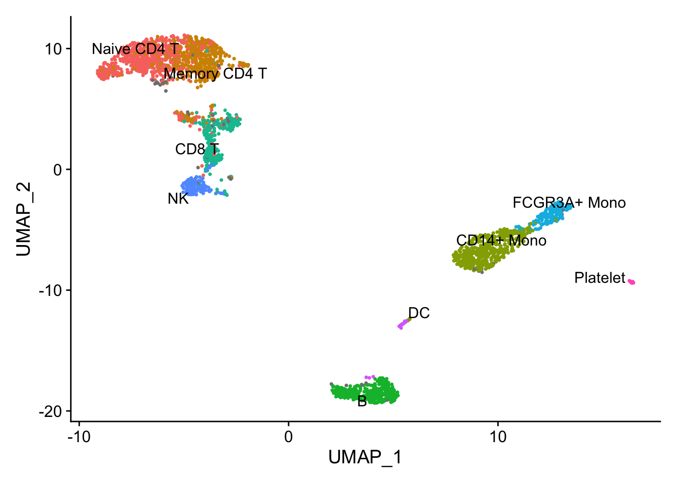
Now we’ll get a list of 20 genes enriched in the cells with the most badass name:
# Get top 20 genes enriched in natural killer cells
nk_enriched <- FindMarkers(pbmc, ident.1 = "NK", verbose = FALSE) %>%
  arrange(-avg_log2FC) %>%
  rownames_to_column(var = "gene") %>%
  pull(gene) %>%
  .[1:20]
Use this list of 20 genes to score cells using the AddModuleScore function:
pbmc <- AddModuleScore(pbmc,
                  features = list(nk_enriched),
                  name="NK_enriched")

# Plot scores
FeaturePlot(pbmc,
            features = "NK_enriched1", label = TRUE, repel = TRUE) +
            scale_colour_gradientn(colours = rev(brewer.pal(n = 11, name = "RdBu")))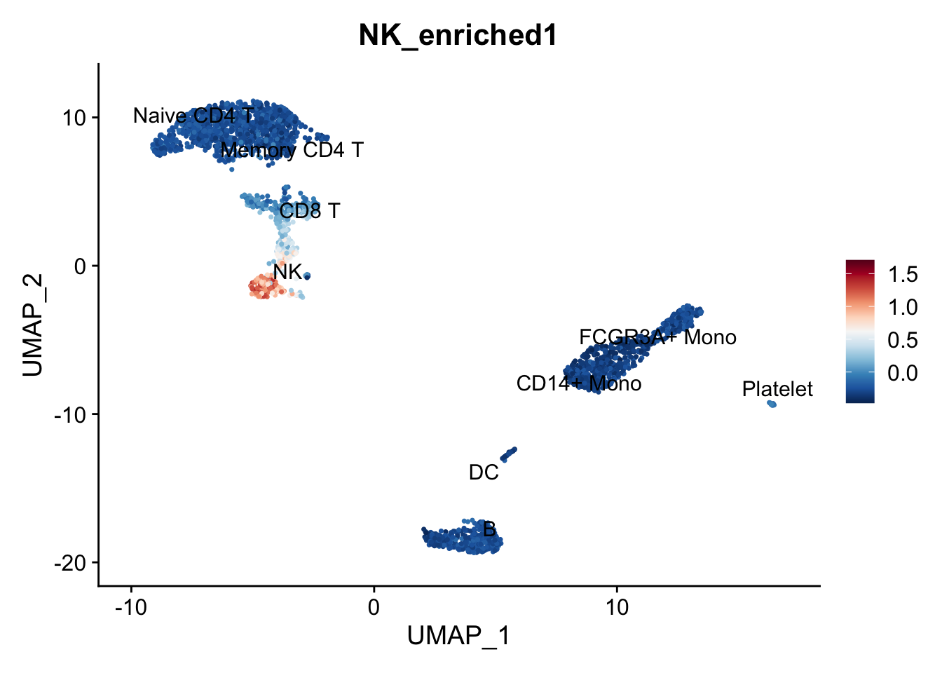
Makes sense but how were those scores actually calculated? The reference given is Tirosh et al, Science (2016), where from the supplementary materials we find:
The top 100 MITF-correlated genes across the entire set of malignant cells were defined as the MITF program, and their average relative expression as the MITF-program cell score. The average expression of the top 100 genes that negatively correlate with the MITF program scores were defined as the AXL program and used to define AXL program cell score. To decrease the effect that the quality and complexity of each cell’s data might have on its MITF/AXL scores we defined control gene-sets and their average relative expression as control scores, for both the MITF and AXL programs. These control cell scores were subtracted from the respective MITF/AXL cell scores. The control gene-sets were defined by first binning all analyzed genes into 25 bins of aggregate expression levels and then, for each gene in the MITF/AXL gene-set, randomly selecting 100 genes from the same expression bin as that gene. In this way, a control gene-sets have a comparable distribution of expression levels to that of the MITF/AXL gene-set and the control gene set is 100-fold larger, such that its average expression is analogous to averaging over 100 randomly-selected gene-sets of the same size as the MITF/AXL gene-set.
Let’s look at how the Seurat authors implemented this. We’ll ignore any code that parses the function arguments, handles searching for gene symbol synonyms etc. and focus on the code used to calculate the module scores:
# Function arguments
object = pbmc
features = list(nk_enriched)
pool = rownames(object)
nbin = 24
ctrl = 100
k = FALSE
name = "NK_enriched"
seed = 1

# Find how many gene lists were provided. In this case just one.
cluster.length <- length(x = features)

# Pull the expression data from the provided Seurat object
assay.data <- GetAssayData(object = object)
# For all genes, get the average expression across all cells (named vector)
data.avg <- Matrix::rowMeans(x = assay.data[pool, ])
# Order genes from lowest average expression to highest average expression
data.avg <- data.avg[order(data.avg)]

# Use ggplot2's cut_number function to make n groups with (approximately) equal numbers of observations. The 'rnorm(n = length(data.avg))/1e+30' part adds a tiny bit of noise to the data, presumably to break ties.
data.cut <- ggplot2::cut_number(x = data.avg + rnorm(n = length(data.avg))/1e+30,
                                n = nbin,
                                labels = FALSE,
                                right = FALSE)

# Set the names of the cuts as the gene names
names(x = data.cut) <- names(x = data.avg)

# Create an empty list the same length as the number of input gene sets. This will contain the names of the control genes
ctrl.use <- vector(mode = "list", length = cluster.length)

# For each of the input gene lists:
for (i in 1:cluster.length) {
  # Get the gene names from the input gene set as a character vector
  features.use <- features[[i]]

  # Loop through the provided genes (1:num_genes) and for each gene, find ctrl (default=100) genes from the same expression bin (by looking in data.cut):
  for (j in 1:length(x = features.use)) {
        # Within this loop, 'data.cut[features.use[j]]' gives us the expression bin number. We then sample `ctrl` genes from that bin without replacement and add the gene names to ctrl.use.
        ctrl.use[[i]] <- c(ctrl.use[[i]],
                           names(x = sample(x = data.cut[which(x = data.cut == data.cut[features.use[j]])],
                                            size = ctrl,
                                            replace = FALSE)))
    }
}

# Have a quick look at what's in ctrl.use:
class(ctrl.use)
## [1] "list"
length(ctrl.use)
## [1] 1
class(ctrl.use[[1]])
## [1] "character"
# There should be length(features.use)*ctrl genes (i.e. 20*100):
length(ctrl.use[[1]])
## [1] 2000
It’s worth pausing here to have a look at what we’ve got so far. I’ll create an explanatory plot for this:
# Plot the bins that have been created to split genes based on their average expression
plot(data.avg, pch=16, ylab="Average expression across all cells", xlab="All genes, ranked")
for(i in unique(data.cut)){
cut_pos <- which(data.cut==i)
if(i%%2==0){
  rect(xleft = cut_pos[1], ybottom = min(data.avg), xright = cut_pos[length(cut_pos)], ytop = max(data.avg), col=scales::alpha("grey", 0.3))
} else {
  rect(xleft = cut_pos[1], ybottom = min(data.avg), xright = cut_pos[length(cut_pos)], ytop = max(data.avg), col=scales::alpha("white", 0.3))
}
}

# Add red points for selected control genes
points(which(names(data.avg)%in%ctrl.use[[1]]), data.avg[which(names(data.avg)%in%ctrl.use[[1]])], pch=16, col="red")

# Add blue points for genes in the input gene list
points(which(names(data.avg)%in%features[[1]]), data.avg[which(names(data.avg)%in%features[[1]])], pch=16, col="blue")

# Add a legend
legend(x = "topleft",
       legend = c("gene", "selected control gene", "gene in geneset"),
       col = c("black", "red", "blue"),
       pch = 16)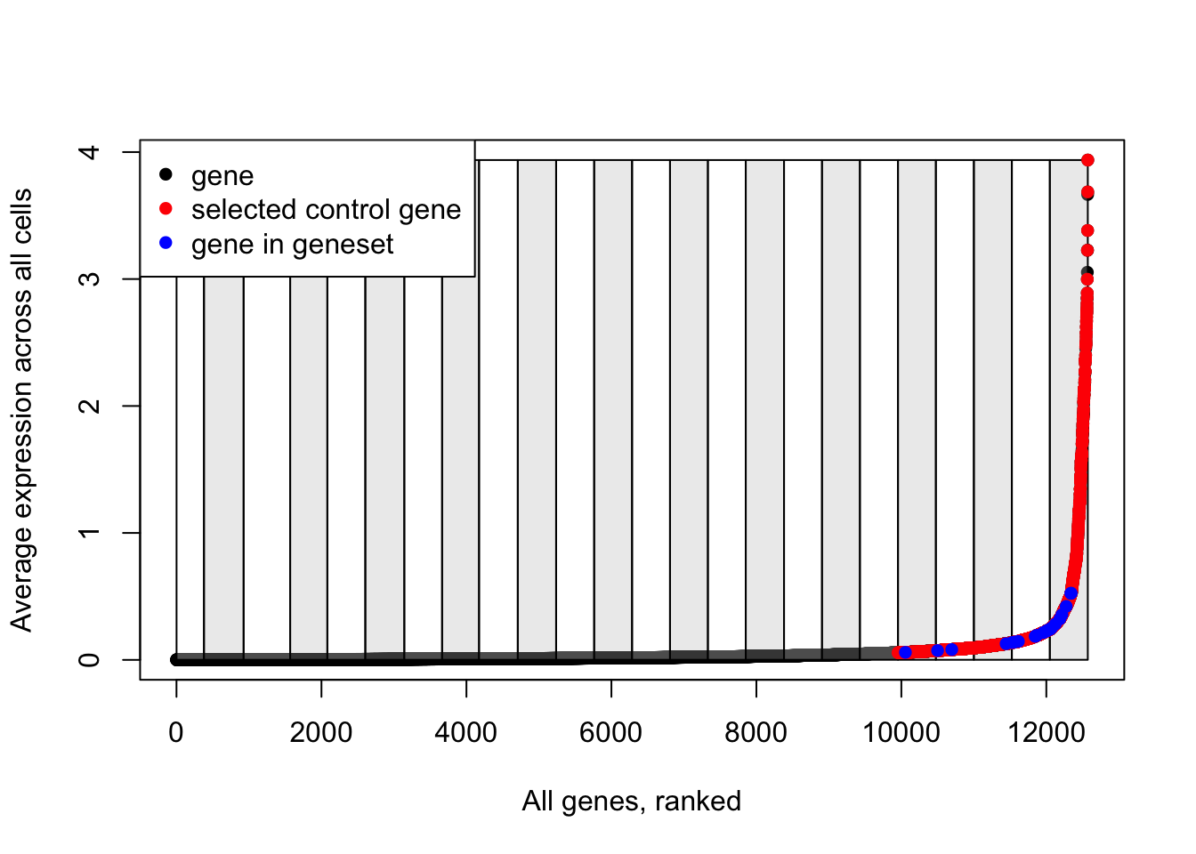
Note how control genes are only selected from the bins in which the genes in our input list fall.
# Remove any repeated gene names - even though we set replace=FALSE when we sampled genes from the same expression bin, there may be more than two genes in our input gene list that fall in the same expression bin, so we can end up sampling the same gene more than once.
ctrl.use <- lapply(X = ctrl.use, FUN = unique)


## Get control gene scores

# Create an empty matrix with dimensions;
  # number of rows equal to the number of gene sets (just one here)
  # number of columns equal to number of cells in input Seurat object
ctrl.scores <- matrix(data = numeric(length = 1L),
                      nrow = length(x = ctrl.use),
                      ncol = ncol(x = object))

# Loop through each provided gene set and add to the empty matrix the mean expression of the control genes in each cell
for (i in 1:length(ctrl.use)) {
  # Get control gene names as a vector
  features.use <- ctrl.use[[i]]
  # For each cell, calculate the mean expression of *all* of the control genes
  ctrl.scores[i, ] <- Matrix::colMeans(x = assay.data[features.use,])
}


## Get scores for input gene sets

# Similar to the above, create an empty matrix
features.scores <- matrix(data = numeric(length = 1L),
                          nrow = cluster.length,
                          ncol = ncol(x = object))

# Loop through input gene sets and calculate the mean expression of these genes for each cell
for (i in 1:cluster.length) {
    features.use <- features[[i]]
    data.use <- assay.data[features.use, , drop = FALSE]
    features.scores[i, ] <- Matrix::colMeans(x = data.use)
}
Now we have two matrices;
- ctrl.scores - contains the mean expression of the control genes for each cell
- features.scores - contains the mean expression of the genes in the input gene set for each cell
We’re pretty much there:
# Subtract the control scores from the feature scores - the idea is that if there is no enrichment of the genes in the geneset in a cell, then the result of this subtraction should be ~ 0
features.scores.use <- features.scores - ctrl.scores

# Name the result the "name" variable + whatever the position the geneset was in the input list, e.g. "Cluster1"
rownames(x = features.scores.use) <- paste0(name, 1:cluster.length)

# Change the matrix from wide to long
features.scores.use <- as.data.frame(x = t(x = features.scores.use))

# Give the rows of the matrix, the names of the cells
rownames(x = features.scores.use) <- colnames(x = object)

# Add the result as a metadata column to the input Seurat object
object[[colnames(x = features.scores.use)]] <- features.scores.use

# Voila!
FeaturePlot(object,
            features = "NK_enriched1") +
  scale_colour_gradientn(colours = rev(brewer.pal(n = 11, name = "RdBu")))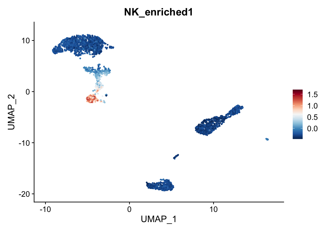
It’s good to know how the function works, because there can be some gotchas. For example what if we had another PBMC sample that happened to be depleted of natural killer cells?
pbmc2 <- subset(pbmc, cells = colnames(pbmc)[pbmc$seurat_annotations %in% c('B', 'DC', 'Platelet', 'CD14+ Mono', 'FCGR3A+ Mono', 'Naive CD4 T')]) %>%
  SCTransform(verbose = FALSE) %>%
  RunPCA(verbose=FALSE) %>%
  RunUMAP(dims=1:30, verbose = FALSE) %>%
  AddModuleScore(features = list(nk_enriched),
                  name="NK_enriched_new")

# Get data for plotting
plot_data <- data.frame(
  NK_present = pbmc$NK_enriched1[colnames(pbmc)%in%colnames(pbmc2)],
  NK_missing = pbmc2$NK_enriched_new1
)
ggplot(plot_data, aes(x = NK_present, y = NK_missing)) +
  geom_point() +
  ylim(c(-0.5, 0.5)) +
  xlim(c(-0.5, 0.5)) +
  ggtitle("NK gene module scores")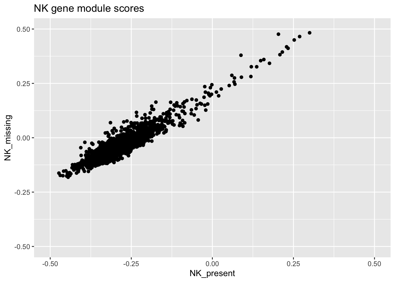
Notice how the scores for each cell depend on the composition of the dataset? It might not matter depending on what you want to do, but it’s good to know about it anyway.